
Status: draft. Verified steps and screenshots to come.
This module covers making figures from simulation output, molecules, density maps and volumes on AMA27, and reproducing them with a script. It runs as a half-day workshop, 3½ hours with a break, and the lessons behind it take 5 to 15 minutes each on their own. No visualization experience is assumed; the batch segment goes faster if you have submitted a job before.
Note
Cluster details. Highlighted values are placeholders. AMA27's queue names, module versions, paths and addresses go in when the cluster is deployed.
Why this matters
Figures are how you check a result, find a bug in a simulation, and show other people what you found. Large results are slow to copy to a laptop, and may not fit on one. OnDemand runs the visualization programs on the cluster, beside the data, and shows them in your browser. This module covers picking a picture that suits your kind of data, making it, and making it again by script.
For example: a simulation writes hundreds of gigabytes of velocity and temperature fields. Instead of downloading them, you open ParaView on the cluster and trace where the hot air goes, then leave a batch job to render every time step.
What you'll be able to do
- Name the kind of data in front of you, and the program on the dashboard that opens it.
- Get a first figure out of that program and save it at a size a paper will take.
- Apply two or three techniques from your own field to your own files.
- Record a ParaView session as Python and rerun it as a batch job across a time series.
- Say what a figure's color map hides, including in your own figures.
Key ideas
A CT scan, a finite-element run, a protein, a genome track and a table of measurements all need different kinds of figure, and no one program handles them all well. The first segment practises identifying the kind of data before choosing a program. → Glossary: mesh, grid and image data
Inside a visualization program the picture is a chain: a reader opens the file, filters transform what it produced, and a display draws the result. Nothing edits the file on disk, so you can change an earlier step and everything after it redraws. → Glossary: visualization pipeline
There are three common ways into 3-D data, and each one loses something. An isosurface shows the surface at a single value, not what lies on either side of it. A slice shows every value on one plane and none off it. Volume rendering shows the whole field semi-transparently, but you cannot judge depth from it. Many figures combine two.
The color map changes how the data reads. A rainbow map's bright bands look like edges, so a smooth gradient looks stepped, and readers with red-green color blindness cannot put its colors in order. Maps whose lightness rises evenly, such as Viridis, make equal steps in the data look equal. → Glossary: color map
ParaView can record your clicks as Python and replay them without a window, so a figure can be rebuilt exactly. When the simulation is rerun, or a reviewer asks for a change, you run the script again in a job. → Glossary: the ParaView family
Before you start
- An account on the cluster: AMA27 account instructions, to come.
- Pre-work, about 10 minutes: Start an OnDemand session. Arrive with a working session. To bring your own data to the branch labs, also do Get your data where the app can see it.
- For the batch segment: module A2 Part 1, or having submitted one Slurm job.
Tutorials in this module
The workshop is built from these lessons. Each one stands alone, and the order below is the one the workshop takes. Lessons marked planned are being written.
| # | Lesson | Minutes | What it adds |
|---|---|---|---|
| 1 | Start an OnDemand session | 10 | A program running on a compute node, in your browser |
| 2 | Get your data where the app can see it | 10 | Your own files in reach of the apps. The lessons below use data that comes with their program |
| 3 | Start ParaView on OnDemand | 10 | Open, move, color, save |
| 4 | What kind of data do I have? (planned) | 5 | Point or cell data, scalar or vector, and what each one lets you draw |
| 5 | Color maps that don't lie (planned) | 5 | One direction for temperature, two for a difference around zero |
| 6 | Draw streamlines in ParaView | 10 | Where a flow goes, and what it carries |
| 7 | See orbitals and electron density in ParaView | 15 | Surfaces through a molecular grid |
| 8 | Arrows on a slice (planned) | 10 | Direction and speed on one plane |
| 9 | Values along a line (planned) | 5 | A profile, as numbers and as a plot |
| 10 | Derived fields: vorticity and Q-criterion (planned) | 15 | Where a flow swirls, computed two ways |
Two of the lessons have versions for other programs. The comparisons, streamlines across programs and orbitals across programs, say what each one reads and draws. The ParaView lessons page lists the rest of the ParaView set as it is written.
Schedule
| Segment | Minutes | Demo or Do | Outcome |
|---|---|---|---|
| 1. Seeing your data | 20 | Demo + discussion | 1, 5 |
| 2. Your first program: ParaView | 25 | Do (follow along) | 2 |
| 3. Branch lab 1 | 40 | Do | 3 |
| Break | 10 | ||
| 4. Branch lab 2 | 40 | Do | 3 |
| 5. Batch production | 40 | Do | 4 |
| 6. Figure critique | 15 | Do (in pairs) | 5 |
| 7. Where next, and questions | 20 | Demo + Q&A |
Segments
1. Seeing your data (20 min)
Explain. Volumes, meshes, particles, molecules, genome tracks and tables each suit different pictures, and different programs draw them best. Values stored at points or per cell, and single numbers (scalars) or directions (vectors), decide which filters apply. Choose a color map to fit the data, not for appearance: one-directional data gets a sequential map, signed data a diverging map centered on zero.
Do. In pairs, sort six example datasets into data type, first picture and program, using the lesson map. The six: a CT scan, a CFD run, a protein, a cryo-EM map, a sequencing run and a climate grid. About 10 minutes.
You should see. Each dataset matched to a branch of the lesson map. Where a pair disagrees, work out why.
2. Your first program: ParaView (25 min)
Explain. Everyone starts in ParaView, so the class shares one vocabulary: the pipeline, Apply, coloring by a variable, rescaling and saving a picture.
Do. Start ParaView on OnDemand, with disk_out_ref.ex2.
You should see. Your own screenshot of the disk, colored by temperature with the Viridis map, saved in scratch.
3. Branch lab 1 (40 min)
Explain. Each participant works through the lessons for their own field, from the list above or the lesson map. Instructors circulate.
Do. The first two or three lessons for your field, for example:
- Flow and transport: streamlines in ParaView, then arrows on a slice.
- Quantum chemistry: orbitals and electron density, in GaussView, ParaView, ChimeraX or PyMOL, then the electrostatic potential on a density surface.
- Structural biology: a clear protein figure, then a mutation, both in PyMOL.
- Imaging: slices, then isosurfaces, of a CT scan.
- Genomics: reads and coverage at a gene, then finding a known variant.
You should see. One finished figure, and the session file or script that remakes it.
4. Branch lab 2 (40 min)
Explain. Go further in the same field, or try a lesson from another one. Pairs from different fields compare what each picture hides.
Do. The next lessons on your own list.
You should see. A second figure, and an explanation of what it shows that the first does not.
5. Batch production (40 min)
Explain. Use the window to explore. Use a script to render every time step, dataset and revision. ParaView records your clicks as Python; pvbatch replays that Python with no window, so a Slurm job can run it.
Do. Record a trace of the streamlines figure, tidy it into a script, and run it with pvbatch in a batch job. Then assemble frames into a movie. The lessons From clicks to a script, Batch rendering and Frames to a movie are being written; the worked example below covers the core.
You should see. PNG files written by a job that ran while you did something else.
6. Figure critique (15 min)
Explain. Five questions for any figure:
- Can I tell what is shown without the caption?
- Does the color map fit the data?
- Is there a scale or legend?
- Would it survive grayscale printing and a colorblind reader?
- Is anything cropped or hidden that matters?
Do. Swap figures with a partner and apply the five questions.
You should see. At least one concrete improvement for each figure.
7. Where next, and questions (20 min)
Explain.
- Client and server ParaView: your own computer draws the window while a server on the cluster reads the data. It takes setting up, and the client version must match the server's.
- VisIt: another visualization program, with readers for some simulation formats ParaView handles less well.
- In situ tools (ParaView Catalyst, Ascent): make pictures while a simulation runs, instead of saving all its data.
- The plotting lessons: 2-D plots in Python or R.
Do. Questions, and choosing which lessons to do next.
You should see. Each participant has chosen the next two or three lessons for their own data.
Worked example
The streamlines figure as a script: scripts/streamlines.py. Each block matches a click from the lesson Draw streamlines in ParaView.
Run in: a batch job, as part of streamlines.py (an annotated excerpt)
reader = OpenDataFile(data_file)            # File ▸ Open…
reader.UpdatePipeline()                     # Apply: actually read the file
names = list(reader.PointData.keys())       # the variables it found

velocity = pick("V", "v")                   # array names differ in case between
temperature = pick("Temp", "temp")          # ParaView versions, so look them up

view = GetActiveViewOrCreate("RenderView")  # the render view in the middle of the window
Show(reader, view).SetRepresentationType("Outline")   # Representation ▸ Outline

tracer = StreamTracer(Input=reader)         # Filters ▸ Alphabetical ▸ Stream Tracer
tracer.Vectors = ["POINTS", velocity]       # Vectors = V
tubes = Tube(Input=tracer)                  # Filters ▸ Alphabetical ▸ Tube

display = Show(tubes, view)
ColorBy(display, ("POINTS", temperature))   # the coloring drop-down ▸ Temp
display.RescaleTransferFunctionToDataRange(True, False)   # Rescale to Data Range

SaveScreenshot(out_png, view, ImageResolution=[1600, 1200])   # File ▸ Save Screenshot…
Three things make it robust enough for a batch job:
- It looks array names up instead of assuming them.
- It tries both spellings of the Viridis preset, since the name differs between ParaView versions.
- It renders offscreen.
To run it in a batch job, load ParaView (AMA27 ParaView module) and run pvbatch --opengl-window-backend OSMesa streamlines.py disk_out_ref.ex2 out.png. Older ParaView builds can fail here: their offscreen rendering needs OSMesa support, which not every build has.
What you should see
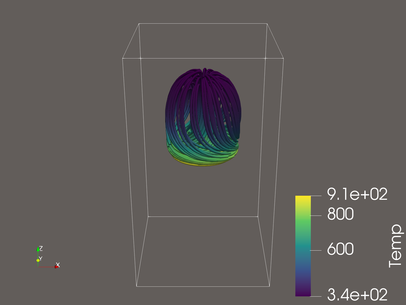
pvbatch in a batch job.Check your understanding
A colleague has a folder of cryo-EM maps and wants figures for a paper. Which program would you suggest, and which kind of picture?
ChimeraX: it opens a map from a file or straight from a public cryo-EM archive. A common picture is an isosurface at a chosen threshold, with the fitted atomic model shown inside it.
Why is a rainbow color map a poor choice for a temperature field?
Its bright bands (yellow, cyan) create boundaries that aren't in the data, and colorblind readers can't order its colors. A sequential map such as Viridis changes evenly in lightness, so equal steps in temperature look like equal steps in color.
Your batch job's pvbatch script fails with an error about opening a display. What's wrong, and what are two ways around it?
Compute nodes have no screen, so draw in memory instead: load ParaView (AMA27 ParaView module), then run pvbatch --opengl-window-backend OSMesa. Or run the script in a terminal inside a desktop session, which has a display.
Common pitfalls
| What you see | Why it happens | What to do |
|---|---|---|
| Your time allocation drains while you're not working | An OnDemand session was left running after the tab was closed | Delete sessions on My Interactive Sessions when done |
| The app can't find your data | Apps open in your home directory; the data is in scratch | Link scratch into home, as in Get your data |
| A new variable shows as one flat color | The color scale still fits the previous variable | Rescale to Data Range |
| A figure looks striped or banded | A rainbow color map | Switch to Viridis (one direction) or a diverging map (signed values) |
| A batch render fails with a display error, or aborts | Compute nodes have no screen, and not every ParaView build renders offscreen | Load a ParaView built with OSMesa (AMA27 ParaView module), then pvbatch --opengl-window-backend OSMesa; or run it in a desktop session's terminal |
pvbatch stops with version `GOMP_5.0' not found |
An older GCC module is loaded, and ParaView finds its OpenMP library first | module purge, then load ParaView again |
| Hours spent copying results to a laptop to look at them | The data is being copied to the program instead of the program being run where the data is | Visualize on the cluster; bring back only pictures and small extracts |
Cheat sheet and next steps
- Start any program: OnDemand ▸ Interactive Apps ▸ the program; a queue for short interactive work (AMA27 queue name); delete the session when done.
- ParaView: Apply after every change; Rescale to Data Range after changing variables; File ▸ Save State keeps your whole pipeline.
- By script: Tools ▸ Start Trace, then run the result in a batch job: load ParaView (AMA27 ParaView module), then
pvbatch --opengl-window-backend OSMesa script.py. - Every lesson, by what you want to see: the lesson map.
- Next modules: B4, for storing data so it is easier to visualize later; A2 Part 2, for running many render jobs at once.
Credits and licenses
Lesson data:
- ParaView example data (Kitware/Sandia, BSD-3-Clause);
- PDB (CC0) and AlphaFold DB (CC-BY 4.0);
- EMDB, ClinVar and 1000 Genomes (freely available archives);
- formaldehyde cubes computed with PySCF (Apache-2.0).